a year of HollisWealth
Today marks my last day at Holliswealth (Scotiabank’s wealth management subsidiary), where I worked as a one-man in-house full-service agency. That’s a lot of hyphens. Essentially, I branded the personal practices of financial advisors. While I’m excited to move to Paris, leaving is still bittersweet. My time at Holliswealth has been the largest contributor to my growth and learning as a designer. As I have never had technical training in art and design, practice is my only source of improvement in those fields. I have been drawing and illustrating since I can remember, but it’s rarer to find opportunities to execute professional design. High school and university provided me experience doing posters and other collateral here and there, but until I took this job, I’d never had to sit and churn out logos for actual established businesses. That volume, I think, is what has helped me improve the most.
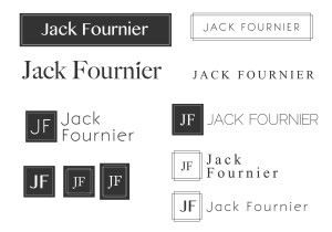
I recently happened upon some files from my early days at Hollis and cringed so hard my entire body crumpled a little. Starting out, I had a very limited working knowledge of Illustrator as up until that point, the vast majority of my work had been raster illustrations. Incidentally, I first began working with PS in the summer of the 5th grade, and evolved with the software from CS2 to CC. It’s been quite the ride. Illustrator, however, was a new animal for me, and I spent the better part of a month frantically googling how to make it do things. The result? A slew of simplistic, geometric or typography-based designs that might have come from an online logo generator. Barf.

what are thooose?
A few months later (once I had finally gotten the hang of the vector thing), I decided to tackle web. Like Illustrator, I had functionally zero experience working with websites. Unlike Illustrator, I did not have years of experience with a similar program and transferrable toolboxes to draw from. In fact, prior to taking the job, I had attempted to set up a WordPress blog to pathetically little success. Coding had always intimidated me, and though I only worked with front-end styling, journeying into this world has been absolutely fun and way less scary than I’d imagined.
It’s been interesting; all of my clients here are financial advisors who are mostly middle-aged white men who haven’t the faintest clue where to begin when it comes to design (and frankly, do not care much anyway). While this meant that I could certainly stick anything in front of them and call it a day, I still made a hell of an effort to not put anything out that I wasn’t proud of. And to whoever says, “the client is always right,” let’s be real here, they sure as hell aren’t. That’s not to say that I haven’t had great clients who work well with me and are easy to please, but the tough ones are the ones from whom I learned the most.
So, in true millennial fashion, here is a list of 15 things I learned at Holliswealth in 2015:
- The true difference between Photoshop, Illustrator, and InDesign
- Sometimes your clients will be dumb
- If that is the case, the best way to convince them to do what you want is to trick them into thinking it was their own idea
- If that doesn’t work, throwing out a bunch of meaningless jargon and buzzwords usually sufficiently disarms them into agreeing with you
- Always always always back up
- The various metrics of Google Analytics collectively mean more than the sum of their parts
- By that, I mean they’re worthless individually
- Optimizing media for web is probably a great idea
- Regardless of the amount of caffeine consumed, the 2pm crash is always inevitable
- If your thermostat isn’t fixed within the first two weeks it’s probably a lost cause; just stop trying, maintenance is never going to get back to you
- At least you get your own office with a window and stuff, that’s pretty cool
- Compliance is the literal worst
- If you don’t ask for something, you won’t get it. But you’d be surprised with what you can get if you do ask.
- Like 80% of being a designer is just waiting for feedback or approval
- Bless Adobe


Leave a Reply